Primary Logo - light background
Download logo
Brandbook Design Guidelines


Autoplovykla.lt
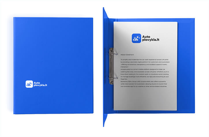
Mission Statement
To simplify and modernize the car wash experience across Lithuania by providing a seamless digital platform for customers and businesses—offering convenience, transparency, and localized support in every interaction.”
Autoplovykla.lt is a smart mobile platform designed to make car washing fast, easy, and accessible across Lithuania. Whether you’re a busy driver looking for the nearest wash or a business owner seeking to manage bookings more efficiently, our app puts everything at your fingertips.
Backed by SEAL Group UAB, Autoplovykla.lt also offers a powerful white-label solution for businesses—allowing anyone to launch their own branded app for car washes or other service-based industries.
The Autoplovykla.lt logo is designed to reflect simplicity, technology, and trust—all key values of the platform. It combines a clear, modern icon with bold typography to ensure high visibility and recognizability across digital and physical formats.
The icon features a stylized car with a location pin, symbolizing smart geolocation services and mobile convenience. Surrounding sparkle elements emphasize cleanliness and the core purpose of the app—keeping your car spotless with just a few taps.
The Autoplovykla.lt icon is a clean, modern graphic that encapsulates the app’s core promise: smart, accessible, and high-quality car care.
To maintain visual clarity and ensure brand recognition, the Autoplovykla.lt logo must always be surrounded by sufficient clear space. This space protects the logo from visual clutter and ensures maximum impact across all applications.
Padding Guidelines
Usage Notes


At Autoplovykla.lt, our core values define how we operate, innovate, and serve. They guide every interaction—from app design to customer support—and reflect our commitment to delivering a seamless, trustworthy, and modern car wash experience across Lithuania.

Clarity
We value simplicity and transparency—in our pricing, our user interface, and our communication.

Trust
We build long-term relationships through reliable service, consistent quality, and responsive support.

Convenience
We make car care effortless, giving users control over their time with just a few taps.

Innovation
We continuously improve through technology, offering a modern and flexible platform for customers and partners.

Multilingual
Our multilingual support and nationwide reach ensure everyone can enjoy a clean car, no matter where they are.

Community
We support local car washes and create meaningful partnerships, helping businesses grow within the Autoplovykla.lt ecosystem.
Autoplovykla.lt uses a clean and vivid color palette that emphasizes clarity, trust, and digital precision. The primary blue shades reflect reliability and innovation, while lighter tones offer freshness and approachability.
Autoplovykla Blue
Primary color
A bold and energetic blue used for main UI elements, highlights, and the brand logo.
Dark Neutral (Black)
Primary Color
A deep, modern black used for typography and contrast, ensuring strong readability and elegance.
Soft Light Blue (Background)
Secondary Color
A subtle, clean background tone that supports a fresh and spacious interface.
We chose Poppins because it combines modern geometric aesthetics with high readability across digital interfaces. Its clean, rounded forms reflect Autoplovykla.lt’s core values — clarity, trust, and innovation — while its versatile weights support both friendly communication and professional tone.
As a Google Font, Poppins is also web-optimized, ensuring fast load times and consistent rendering on all devices, making it ideal for a mobile-first platform like ours.
Why We Chose Poppins
| Element | Font Size | Weight | Line Height | Use Case |
|---|---|---|---|---|
| H1 | 42px | Bold | 120% | Page titles, main sections |
| H2 | 36px | Bold | 120% | Section headings |
| H3 | 30px | Bold | 120% | Sub-sections, smaller headers |
| H4 | 24px | Bold | 125% | Smaller headers, secondary blocks |
| H5 | 20px | Bold | 130% | Labels, minor headings |
| H6 | 18px | SemiBold | 130% | Caption headers, in-line titles |
| p | 18px | Regular | 150% | Body text, descriptions, interface copy |
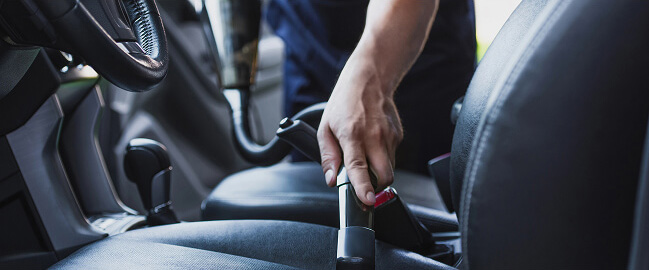
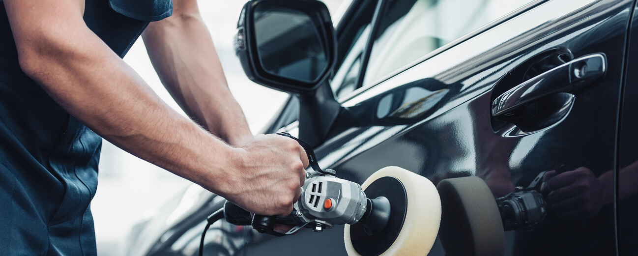
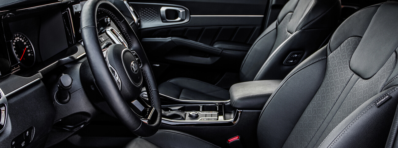
Visual storytelling is key to the Autoplovykla.lt experience. All imagery should reflect cleanliness, motion, and convenience — aligned with our core values of clarity, trust, and user-friendliness.
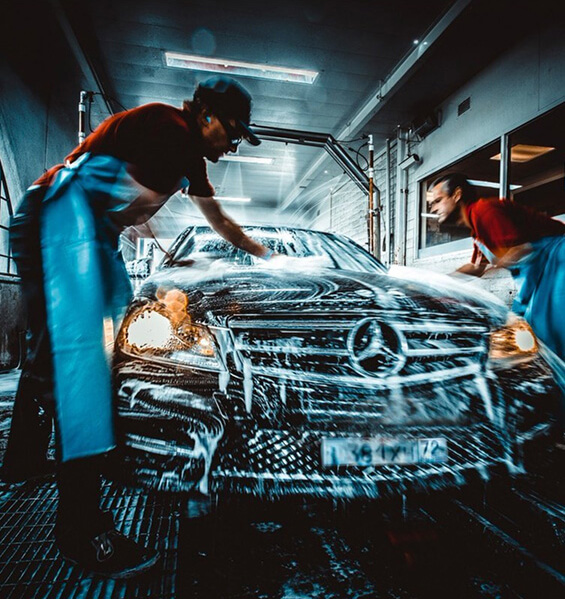

Icons used throughout Autoplovykla.lt reflect a modern, minimalistic, and functional aesthetic. Use icons like: location pin, calendar, credit card, water drops, bubbles, spray gun, car silhouette, clock, checkmark.
DO
DON’T


Consistent spacing and thoughtful layout design are essential to delivering a seamless, intuitive user experience. Autoplovykla.lt uses a grid-based system and modular spacing units to maintain clarity across all digital and print touchpoints.

Grid System
We follow a 12-column responsive grid with flexible gutters and margins, suitable for both desktop and mobile layouts.
Ensure consistent alignment of all UI components — text, images, icons, and CTAs — within the grid structure.

Layout Guidelines
The tone of voice used by Autoplovykla.lt reflects who we are: a modern, helpful, and trustworthy car wash platform. We speak clearly, act professionally, and always put the user first. Whether it’s a website headline, app notification, or support reply, our communication is designed to be easy to understand, friendly in tone, and confident in purpose.
✅ “Find your nearest car wash in seconds.”
✅ “Book. Wash. Drive happy.”
✅ “No hidden fees. Just clean cars.”
✅ “Support in Lithuanian, English, and Russian — because your time matters.”
Clear, consistent messaging is key to building trust with users and ensuring they understand the value of Autoplovykla.lt at every interaction. Our language should reflect ease, efficiency, and reliability — just like our service.

Clarity Over Complexity
Always prioritize simple, straightforward language. Users should understand the message instantly, without needing to interpret or reread.

User Empowerment
Speak to the user’s control — from booking to payment, everything is in their hands. Encourage confidence through clear instructions and positive reinforcement.

Consistency Builds Trust
Keep tone, vocabulary, and style aligned across the app, website, and support channels. A consistent voice builds familiarity and reliability.

Value-First Communication
Focus messaging on what users gain: saved time, convenience, transparent pricing, and reliable support — not just features, but benefits.
Onboarding & Welcome
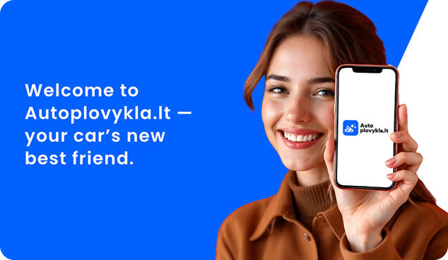
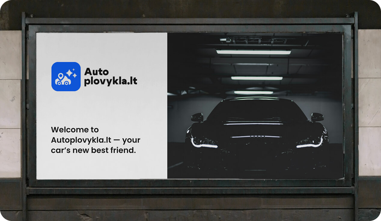
✅ “Welcome to Autoplovykla.lt — your car’s new best friend.”
✅ “Let’s get started — find a wash near you in seconds.”
❌ “System initialized. Proceed to dashboard.”
Service Booking
✅ “Pick a location, choose your service, and you’re set.”
✅ “Your car wash is booked — see you soon!”
❌ “Transaction completed. Confirmation pending.”
Notifications & Reminders
✅ “Your wash is today at 15:00. Ready for a shine?”
✅ “Time for a refresh? Find your nearest car wash.”
❌ “Reminder: event approaching. Check status.”
Customer Support
✅ “We’re here to help — message us anytime.”
✅ “Having trouble? Let’s fix it together.”
✅ “We didn’t find anything yet. Want help?”
❌ “No data found. Please try again.”
❌ “Your issue has been logged. Please wait.”
Maintaining a consistent and high-quality brand experience requires careful attention to how Tommy.lt is represented. These guidelines will help designers, developers, and content creators stay on-brand — every time.

Do:
✅ Use friendly, human-centered language
✅ Write short, active, benefit-focused sentences
✅ Use second person (“you”, “your”) to create personal connection
✅ Highlight the benefit, not just the feature
✅ Keep tone consistent across website, app, and support
✅ Be transparent about pricing, services, and availability
✅ Offer help clearly and proactively

Don’t
❌ Use robotic, overly technical jargon
❌ Overload users with long or passive explanations
❌ Use impersonal or abstract phrasing
❌ Focus only on what the app does, not why it helps
❌ Mix overly casual and overly formal styles
❌ Use vague or misleading language
❌ Wait for users to struggle before offering support
The Autoplovykla.lt interface reflects a modern, user-first digital product. Every element — from headlines to buttons — should feel clear, confident, and friendly. The tone supports a seamless experience by using concise language, avoiding friction, and guiding the user through action.

Clear
We prioritize clarity. All copy should be easy to understand at a glance — no jargon, no filler. If it’s not immediately obvious, we rewrite it.

Friendly
Our voice is helpful, human, and approachable. We talk to people, not users or customers. Messages should feel like they come from someone who cares.

Confident
We know our service works — and that confidence should show. Speak with certainty and direction, especially in action prompts or system messages.

Efficient
Time is valuable. Say more with less. Every line of text should move the user forward or offer value, with no unnecessary repetition.

Modern
Up-to-date, clean phrasing that reflects a sleek digital experience. No outdated idioms or stiff formality.

Helpful
Always aim to assist. Whether guiding a booking or solving a problem, our tone is focused on support and ease.
To maximize discoverability and ensure top performance in both traditional search engines (SEO) and emerging answer engines (AEO), follow these best practices:
Metadata & On-Page Elements
Title Tags
Meta Descriptions
Heading Structure
Content Structure & Quality
Keyword Research & Intent
Readable Formatting
Freshness & Authority
AEO (Answer Engine Optimization)
Featured Snippets & Quick Answers
Conversational Content
Entity Optimization
Our brand identity extends beyond the digital experience. From print to merchandise, email to advertising, every touchpoint is an opportunity to reinforce who we are. Consistent application ensures our brand remains clear, professional, and instantly recognizable—everywhere it appears.
From printed materials to digital ads and app interfaces, consistent application of brand elements ensures a cohesive and professional image. These guidelines help maintain visual integrity and strengthen brand recognition in every customer interaction, partnership, and platform use. Whether you’re designing merchandise, crafting email templates, or creating social content, follow these standards to represent the brand accurately and effectively.

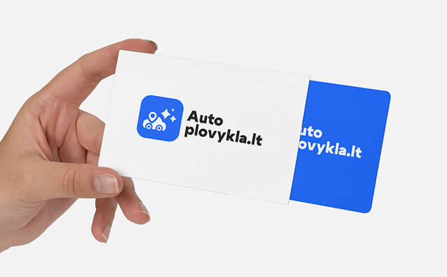
Business Cards
Simple, clean layout using brand colors. Include name, title, contact info, and logo with adequate spacing.
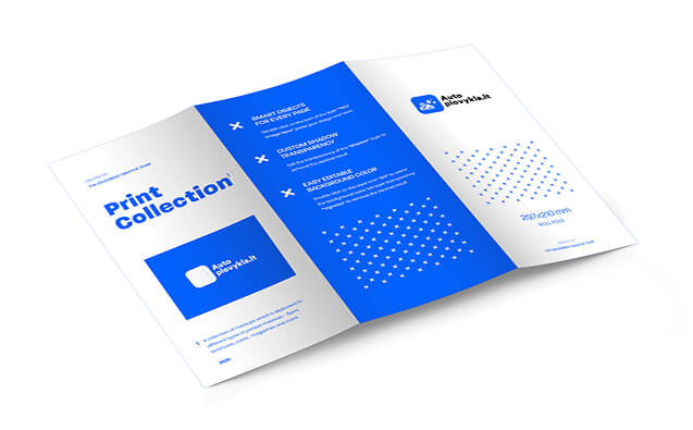
Brochures & Flyers
Visually engaging and informative. Use high-resolution images, bold headings, and consistent typography to explain services and promote offers.
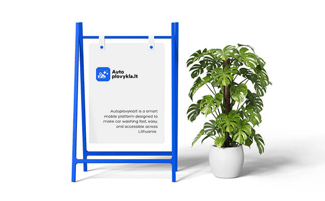
Banners & Signage
Designed for visibility and quick recognition. Use high contrast colors, large logo placement, and minimal but impactful text.
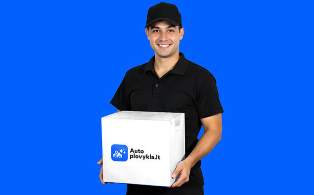
Uniforms & Accessories
Apparel and branded wear should use embroidered or printed logos in designated areas (e.g., chest or sleeve), using approved brand colors.
Consistent email and document design reinforces professionalism and builds trust with users, partners, and stakeholders. All communication should reflect Autoplovykla.lt’s tone—clear, friendly, and reliable.
Email Signatures
Document Formatting Rules
Video Content
Video content should reflect the clean, modern, and professional identity of Autoplovykla.lt.
Keep It Simple and Clear
Focus on clear messaging with minimal effects. Communicate key points within the first few seconds.
User-Centric
Highlight app features and benefits with simple visuals.
Accessible
Include subtitles for accessibility and engagement.
Ad Creatives
Consistency with Brand Guidelines
Always use the approved logo, colors (#0061FE, #2f2f2f), and typography (Poppins) for a unified brand look.
Clear Messaging
Keep copy simple and focused on key benefits, with clear calls-to-action like “Download Now.”
Simple Visuals
Use high-quality, minimalist images with clean backgrounds to avoid clutter.
Mobile Optimization
Ensure ads are optimized for mobile devices, testing across different screen sizes.

Advertising & Media – Sponsorships & Partnerships


Social Media
Strategy
Our social media presence reflects the voice and values of Autoplovykla.lt—simple, helpful, and community-focused. Every post should build trust, drive engagement, and showcase the ease of our service.
Brand Awareness
Leverage social media to showcase the app’s convenience and benefits, promoting it as the go-to solution for car washing.
Platform Selection
Focus on Instagram for visual content, Facebook for community engagement, LinkedIn for B2B connections, and TikTok for engaging, trend-driven videos.
Content Themes
Highlight before-after car wash transformations, features demonstrations, customer testimonials, and environmentally-friendly car care tips.
Posting Frequency
Maintain consistency with 3-4 posts per week on Instagram and Facebook, daily Instagram stories, and 2-3 TikToks per week.
Engagement Tactics
Foster interactions through polls, user-generated content, and prompt responses to comments and direct messages.
Paid Advertising
Utilize targeted Facebook and Instagram ads to promote the app, special offers, and new features, reaching both consumers and business owners.
Primary Channels
Instagram
Showcase car wash results, app features, and customer experiences with high-quality visuals and Stories.
LinkedIn
Focus on B2B marketing, partnerships, and industry-related content.
Facebook
Engage with the community, share updates, and promote offers.